The brand in sound bite
Custom Font for MuseumsQuartier Wien
Custom Font for MuseumsQuartier Wien
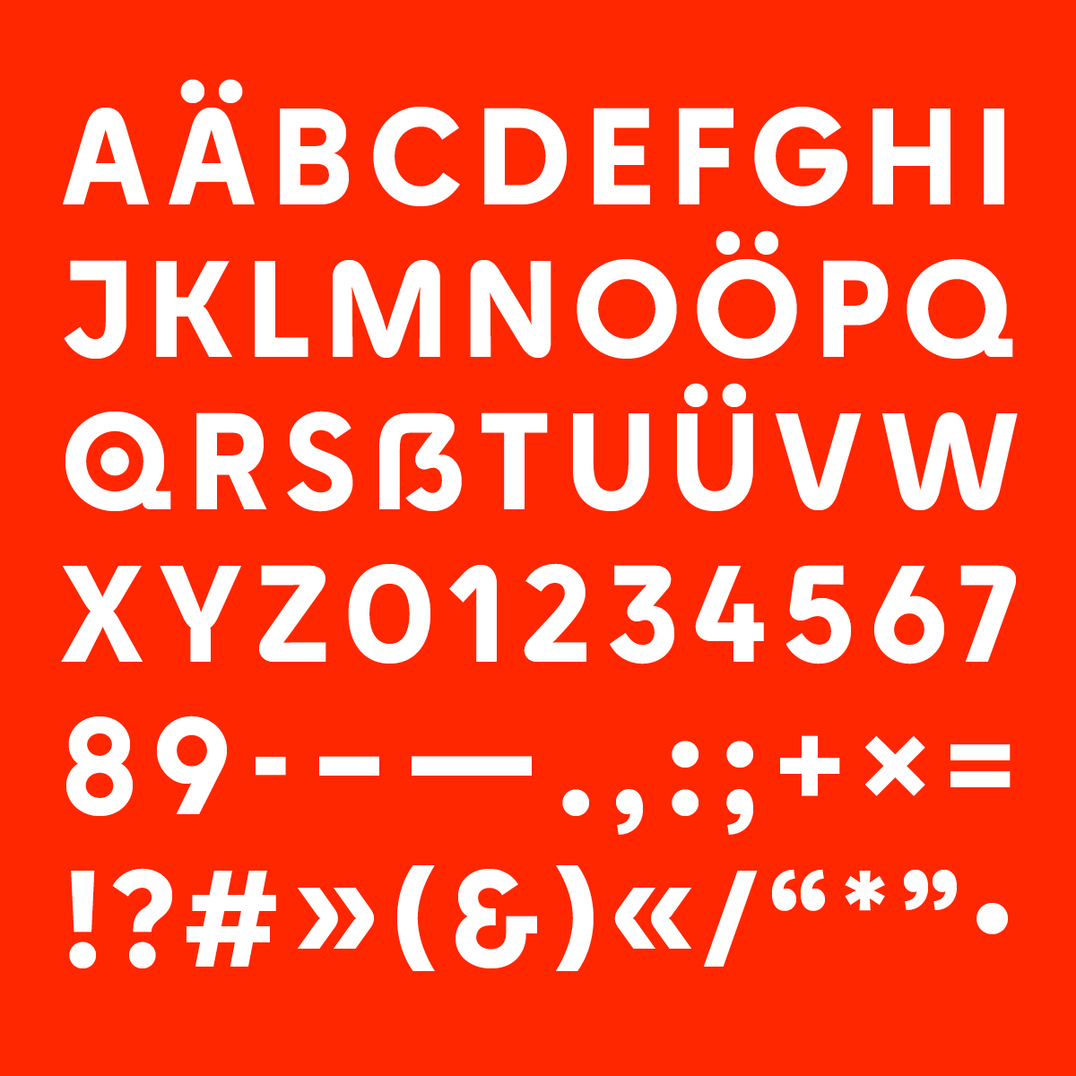
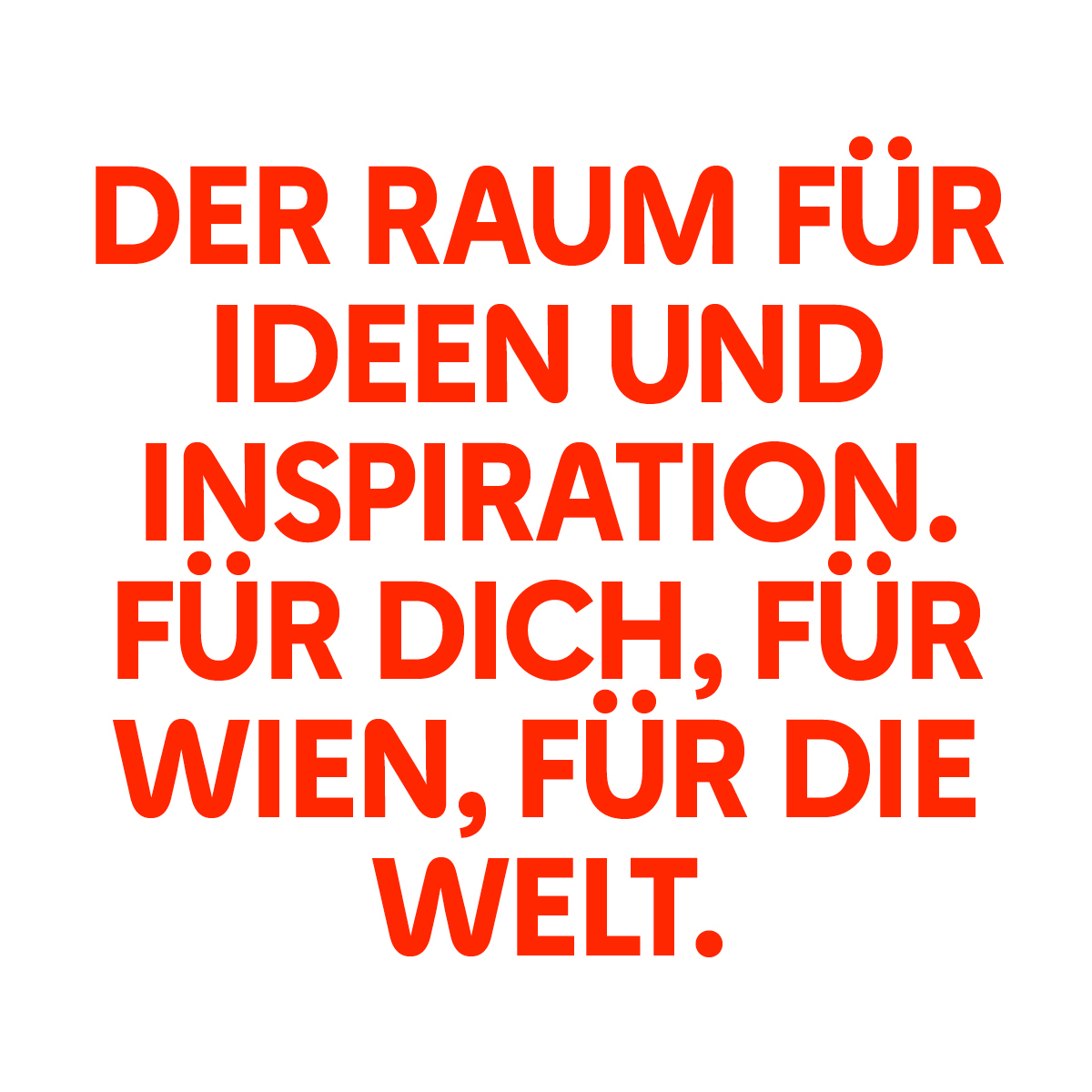
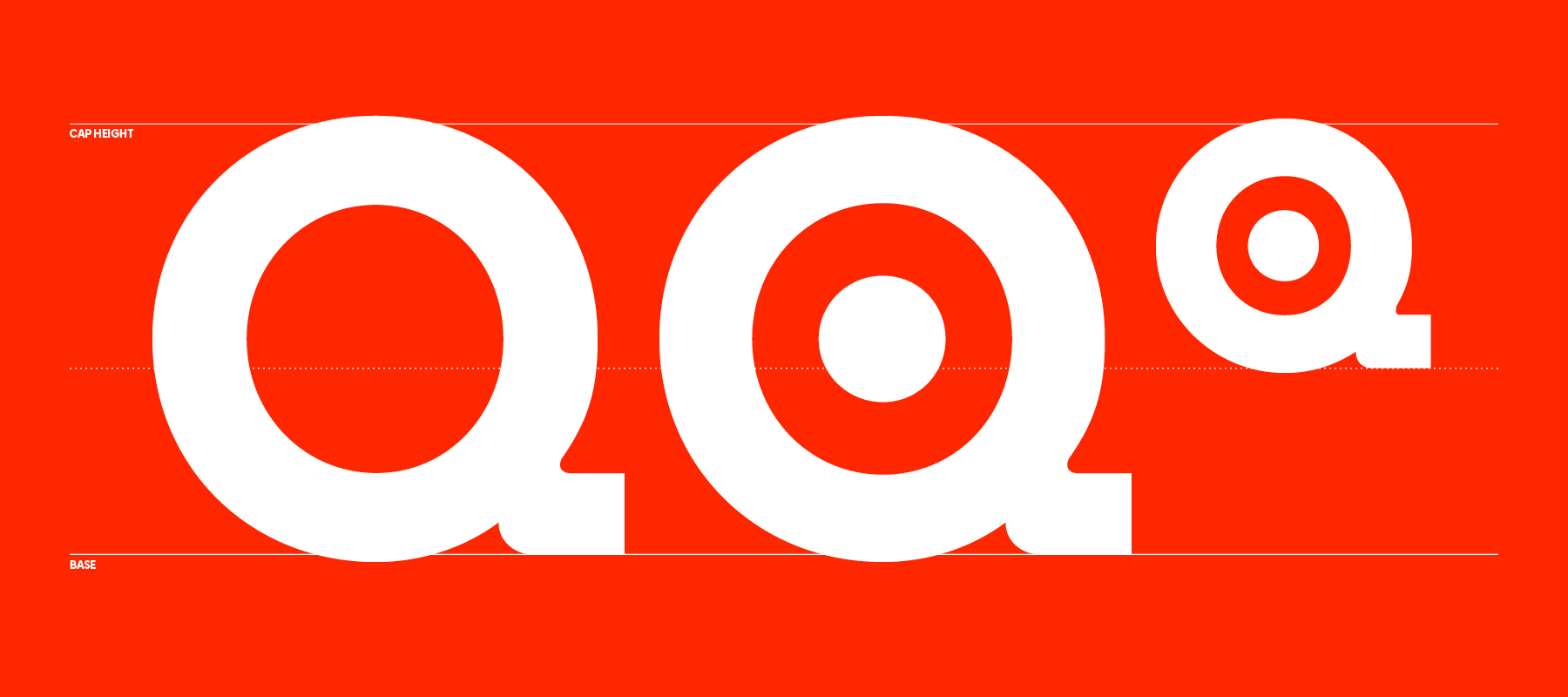
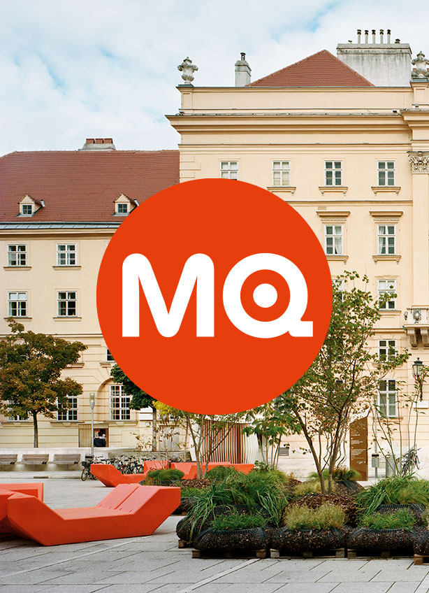
The iconic MQ logo has been around since 2001, and it still works. In the future, it will also set the direction typographically: Based on the letters »M« and »Q« a new, exclusive typeface has been developed for all voices of the MuseumsQuartier, we call it »MQtopia«. It replaces the previous house typeface and now ties all central messages even more closely to the sender in terms of form.
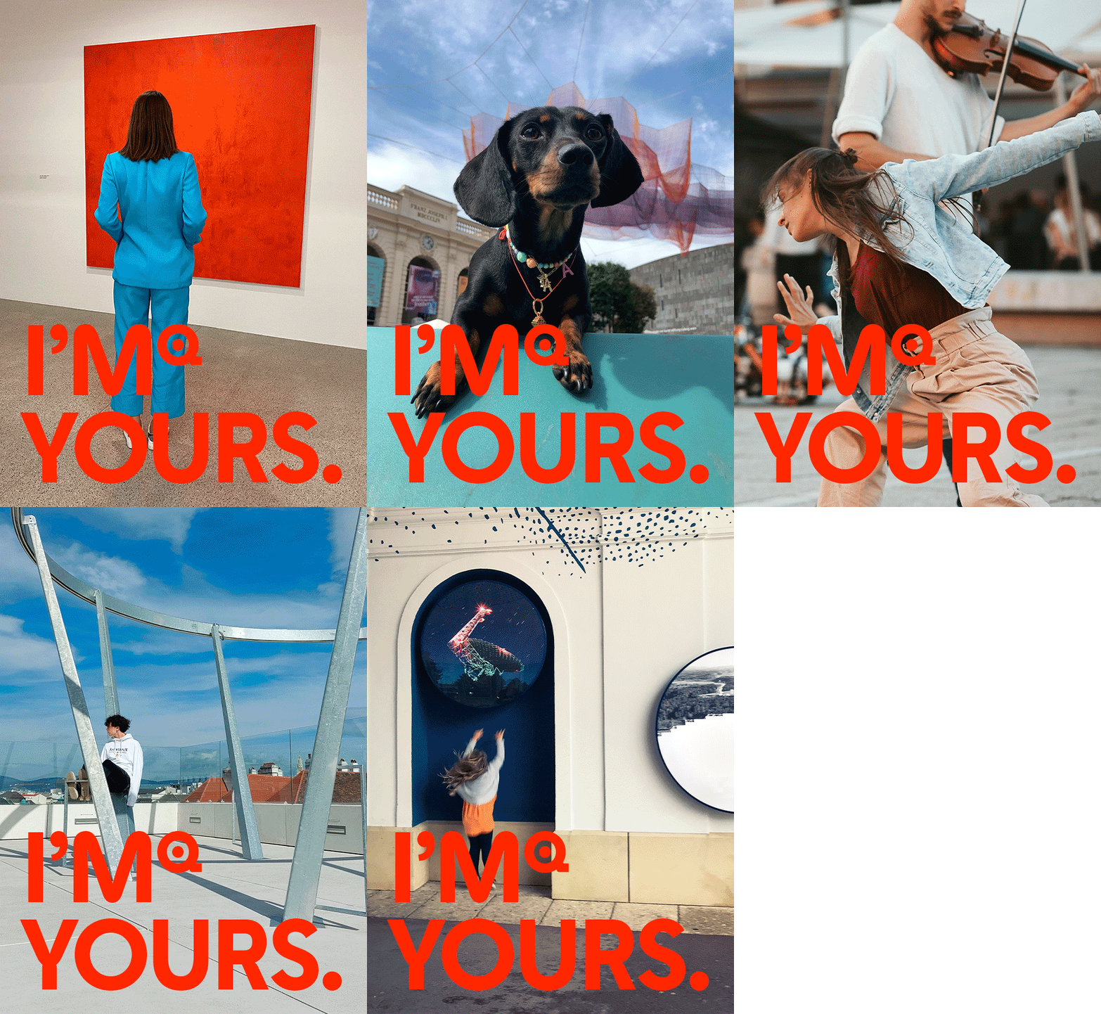
The typeface developed by Rosebud maintains a balance between edges and curves. Without being unnecessarily playful, it is powerful, simple and self-confident. As a display font, it is used for campaign and large headlines. And the MQ logo has also been adapted accordingly and is now composed of the new M and the new Q.